{shortcode-3be8cfd950a9c7830dce32a88c0995187a559e1f}
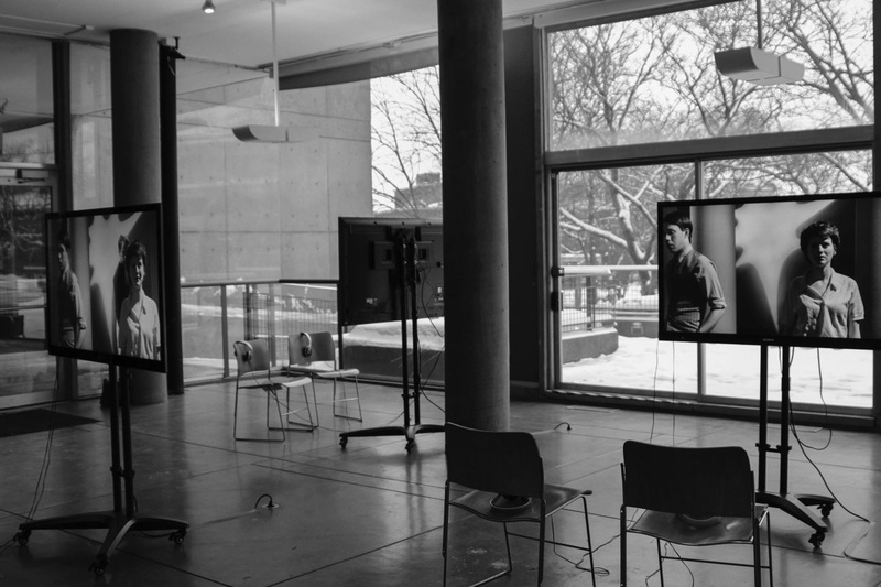
“Our relationship with architecture today...comes from this moment in Modernist architecture when visionaries like Corbusier thought it could…revolutioniz[e] the way people inhabit space,” says James Voorhies, director of the Carpenter Center for the Visual Arts. Curator of the center’s most recent exhibit, Voorhies felt inspired to make some additions to the Corbusier-designed center. According to Voorhies, he came across the idea from inhabiting the center on a regular basis, constantly questioning its design and learning about its history, with the “The Way We Live Now, Modernist Ideologies at Work” as the product. This collection of films, pieces, and structures intends to fascinate as much as it challenges visitors to reconsider how they view and feel about their own surroundings.
The exhibition includes various architectural additions to the center that, from a quick glance, seem a natural extension of the building itself. It is difficult to distinguish what is being exhibited and what is not, for the center is its own piece of art. “That’s the beautiful part of this space. You don’t know you’re walking into an exhibition. You are not aware that your confrontation to this art begins at that moment, as opposed to when you walk into a museum when you are in a position to say ‘OK, this is art,’” Voorhies says.
Cerith Wyn Evans’s “Untitled (Column), 17,” which is featured in the exhibit, is a column comprised of more than 80 fluorescent light bulbs. Modeled after the Corbusier pilotis, or pylons, that support the center, Evans’s structure is naturally installed in the middle of the open lobby space. The lights coalesce into a white beam, emanating a glow that spreads from the center of the room. The work complements the plate-glass window design of the center, and its reflection bouncing off the glass walls generates the illusion of even more pilotis. “It doesn’t seem like it is part of an exhibition that isn’t normally there. It just fits in the space,” says Veronika Polakova, a visitor from the Harvard Law School.
Its natural integration, however, serves an even larger purpose than providing a source of light. “The illuminated column is completely impractical…. But it points out and emphasizes the importance of the use of pilotis in the building,” Voorhies says. “The column in modern architecture allows for the weight to be bared throughout the space as opposed to the walls on the exterior.” According to Voorhies, form follows function and these purposeful columns simultaneously raise the building off the ground and generate openness in the interior.
Another piece of the exhibition, “Re-Make/Re-Model,” was uniquely conceived in the Carpenter Center by artist Amy Yoes. Her inspiration emerged from a site visit to the center; while looking out at the outdoor sunken plaza on Level 1, she saw an opportunity to make her own mark on the building. “Re-Make/Re-Model” is not a permanent change to the foundation but rather a simple modification to what Corbusier initially established. “I wanted to use this seating plan as the base structure for a sculptural intervention that would be using some of the conventions of modernism and the attraction to formal geometric forms,” Yoes says. “I created these shapes that are interlocking with the structure and painted them a very similar gray to the concrete that it almost feels inevitable.” Yoes strives for modesty, to show off and complement the center rather than conceal it.
What distinguishes Yoes’s work is the hybrid use of film projection onto the gray, geometric wood structures. On the surfaces, animated white lines and dots move around, disappearing and reappearing. According to Yoes, these animations are meant to enhance. “These animations...emphasiz[e] certain aspects of the dimension of the piece...as if the lines were searching for the form,” Yoes says. “Yet with the lines chasing each other and the flickering dots there’s a witty nod to the flickering marquee.”
Yoes’s piece is only one instance in the exhibit where animation and film provide unique ways to experience modernist architecture. Another piece, Elizabeth Price’s “At the House of Mr. X,” blends dynamic shots with a choral soundtrack that imbues the interior and objects of Stanley Picker’s home with austerity in spite of its luxury. Yoes similarly says that film plays an integral role in the experience of her structure, emphasizing its scale and form. “I love the word animation because it means bringing life,” Yoes says. “It’s all about searching, and looking for movement…They [the lines and dots] have a lot of personality, even if they’re just lines and dots chasing each other.”
According to Voorhies, the event is about generating a consciousness of the spaces we inhabit, to think beyond their utility. “Of course I understood this before arriving, but it becomes more evident how important the building is and the impact it has on the way we inhabit it and the way work is presented in it,” he says. “The Way We Live Now” highlights not only the recent achievements of artists, but also the Carpenter Center’s beauty in its elegant simplicity.
Read more in Arts
Scott McCloud Discusses Comics, Love, and "The Sculptor"


