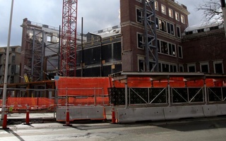
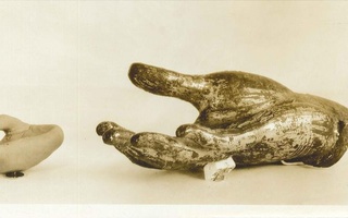
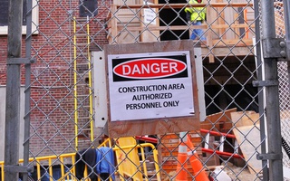
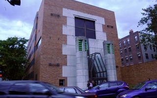
The galleries are closed now. One of the largest collections of art in the country, spanning numerous continents, periods, and media, has been under wraps. Since it closed for renovation in 2008, it has been hidden away from the public and the student body who once enjoyed it. But as with the end of any era, rebirth is not far behind. The galleries of the Sackler may have shut their doors, but from the remnants of the University’s revered Fogg Museum, a new structure, perhaps puzzling at times to its Prescott Street neighbors, has risen.
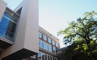
The newly renovated building is a mesmerizing mélange of materials, with panes of glass jutting out from its top and a metallic-gray wood façade that sticks out from the building’s core. And, impressively, these futuristic elements are fused seamlessly with the classic- Harvard brick body of the old Fogg Museum, which is on the National Register of Historic Places. The massive combination—with new additions designed by Italian architect Renzo Piano—has been dubbed the New Harvard Art Museums, and when it opens in November 2014, it will house the collections of the Fogg, Busch-Reisinger, and Arthur M. Sackler Museums under one state-of-the-art roof.
But with its flashy new look, which extends throughout the inner galleries, it would seem that perhaps what was historically a teaching museum aspires to be something more—a tourist attraction. Harvard is already a destination in its own right, but will even more tourist traffic get in the way of the Harvard Art Museums’ purpose as a place for education? A concrete answer can only come in 14 months, but the team behind the new museum is currently striving to walk this thin line between educational hub and tourist magnet. The collection is filling in some of its gaps, and the museum as a whole will offer new platforms and spaces for studying art. The museum also hopes to include not merely students of art, but people from other disciplines and the larger Cambridge community as well. In this way, what began as a renovation of necessity has morphed into something far more ambitious, an attempt to expand the concept of a “teaching museum” in which the museum’s new architecture plays a key role.
THE MAKINGS OF A MODERN MUSEUM
Thomas W. Lentz is a man of carefully controlled passion. From the focused stare he emits through his clear-rimmed glasses to his deliberate but calm speech, everything about the director of the Harvard Art Museums exudes focus and determination. This determination extends to every aspect of the renovation. He seems to know just about everything about the project, down to the wood used in the gallery floor (it’s “walnut-stained oak”) . As he leads our tour through the museum’s now skeletal, white-walled interior, it becomes evident that Lentz wants the new museum to be an “experience.” The focus of the new galleries is on personal, individual interaction with their artworks, which here means smaller, more intimate rooms that contrast heavily with the museum’s courtyard, in which tall glass windows sit atop the classic Ionic columns of the original Fogg. The displays will be less dense than at other museums as well, with more space between the objects exhibited. “There’s clearly a big element of bigger, better, faster in this museum,” Lentz says. “But in many ways we’re trying to go slower and deeper at the same time.”
Lentz makes clear that to him, education will always be at the heart of the Museums’ purpose. “What has driven this entire project is our mission: we’re a teaching museum; we’re a university museum,” he says. “We’re not necessarily driven by attendance and revenue generation; what we’re all about is innovative teaching and learning.” The design of the building, however, shows a distinct aspiration for attracting the outside world; Lentz lists “transparency” and “accessibility” among the key tenets behind the renovation. The museum’s new structure, with large windows, galleries exposed to the street, and a café and shop open to non-museum visitors, seems dedicated to catching the eyes of passers by. “All of a sudden, it’s screaming, ‘This is an art museum,’” Lentz says of the new design.
For members of the public who aren’t within earshot, the museum will be launching a publicity campaign unmatched by any previous efforts. Daron J. Manoogian, director of communications for the Harvard Art Museums, lists print ads, social media, transportation advertising, and even radio among the undertakings in which the museum is investing. “[It’s] a pretty wide cross-section of different things, but more than we’ve ever done before,” says Manoogian. “We really want to be much more welcoming to the public at large and make sure that people can come and see our collections and experience the different kind of gallery spaces that we’ll have in this museum.”
CHARM OFFENSIVE
But while these new kinds of galleries may be a draw for the public, many elements of the museum were designed with students in mind. While the first through third floors are dedicated to public galleries, the futuristic fourth and fifth—as well as the basement—house brand-new facilities for study and conservation. The top floor, cocooned within the Piano-designed “glass lantern” that projects out from the roof, will be a new home to the Straus Center for Conservation and Technical Studies, which focuses on preserving and analyzing works of antiquity and training conservators. Charles S. Klee, a partner at Payette, a Boston architecture firm working on the project, says that aside from its aesthetic appeal, the glass roof of the building actually functions to manipulate natural light for conservation purposes through the use of a series of shades. “If I’m a conservator working on an object or a painting, I can use directional light at a controlled level to understand the texture of the work that I’m looking at,” he explains. Students will also have access to a 300-seat theater, a 100-seat lecture hall, and a 32-seat seminar room in the basement of the building, as well as an experimental space called the Materials Lab, which will explore issues of materiality and how raw materials interact.
The new museum will also attempt to reach out to students in departments other than the most common museum visitors—typically classics and history of art and architecture concentrators. This attempt starts with the architecture, as the Prescott Street ramp of the museum will connect directly to the Le Corbusier-designed ramp of the Carpenter Center for the Visual Arts next door. “It’s a little bit like Le Corbusier putting his arm around the Fogg,” says Klee, quoting Piano. This will make it almost effortless for students producing art to study art.
Perhaps the most important way the museum will connect with students from all departments—as well as the public—is through its expanded, streamlined Art Study Center on the fourth floor. Students, professors, and outside visitors will have the opportunity to request specific types of art for close observation and can even pick art from multiple regions and eras to put pieces in conversation with one another. “It’s essentially art on demand,” Lentz says.
The key to this area of the museum is its easy access. “They had study centers in the original Fogg, but they were behind three-foot wide doors,” says Klee. “And it was a really off-putting kind of event.” The Study Center now has a simple reception desk behind glass doors, and Lentz believes this redesign will be a vital tool for non-art departments. “The people who seemed to be most excited about the new museum were people [from areas] like engineering [and] marine biology,” he says. “They’re interested in works of art for all sorts of reasons we don’t think about, whether it’s materials, production, or process.”
Read more in Arts
"Tower" Rebuilt


