DEMOCRATIC DESIGN
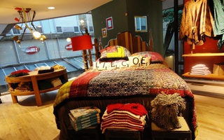
Meanwhile, boutiques and small chains don’t have the logistical challenge of creating a consistent experience across the country. Often, there are only one or two owners of some of the stores in Cambridge and Boston, and as a result, the stores become aesthetic extensions of the owners themselves.
Harvard Square’s Tess & Carlos is one such establishment that derives its unique aesthetic not from any deliberate, centralized design process, but from the bold choices made by the owners, Tess R. Enright and Carlos A. Pava. Tess & Carlos is a clothing distributor, distinguished by its curved display windows and off-center gold column. Despite its unconventional design, it’s not the first vendor visitors to the Square might explore. Perhaps it’s because the store is too dimly lit to see in from the outside, but it begs an investigation into the motivations behind the owners’ choices in their store design and displays.
I walk between the curved glass panels of Tess & Carlos, afraid that it’s closed or vacant because of the dim lighting. But when I walk in, I’m surprised and pleased to find an apparel vendor that is trendy and minimal, its interior design relying on glass and concrete. The lines of the establishment gently curve in contrast to the straight steel clothing racks. All of the merchandise is spread far apart and kept low to the ground. Behind a similarly curving counter is Tess Enright, a woman with intense eyes, but a wide smile.
The design of the store, inside and out, is one conceived and executed by singular forces. Pava designed the architecture of the Harvard Square location as well as the shops in Newton, Mass., Concord, Mass., and Pittsford, N.Y. Enright designs the displays and selects the merchandise. Together, the architecture and merchandising create a clean, minimal, open feel. “Stores should be very airy, so that you can feel like you can walk around,” Enright says.
Enright knows her general demographic—women, usually above 30—but she’s not trying to target anyone in particular. There haven’t been attempts to redesign the store to appeal to different or new customers, nor has there been a need for those attempts. “The store has stayed the same,” Enright says. “We’ve never had to change anything in the store because it’s so minimal and classic, so it really never goes out of style.” As far as Enright is concerned, Tess & Carlos is still ahead of its time, and I’m not sure who would disagree.
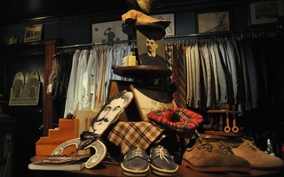
Talking to Bobby raises the same question—for whom is the store and merchandise designed, him or the customer? For customers, Bobby carefully arranges the store to make the merchandise look enticing, even like new. He goes as far as to apologize for a couple of boxes of shoes neatly tucked underneath and beside the pool table that he keeps in the center of the room. He organizes his stores to ensure that customers can easily browse in comfort.
Read more in Arts
Music "In Time of War"Recommended Articles
-
Tall, Skim, Decaf... Fiction?If you’ve ever been on an endless hunt for, say, a classic Elizabeth Bowen novel that hasn’t seen shelves since
-
Loeb Fellow Urges Activism in DesignThere is a growing movement in architecture toward social activism, according to design activist and current Loeb Fellow Bryan Bell.
-
TED Curator Speaks at GSD Class DaySpeaking in front of a packed audience in Piper Auditorium at the Harvard Graduate School of Design’s Class Day, Technology Entertainment and Design (TED) Curator Chris Anderson encouraged the graduating class to pursue knowledge and to never stop learning.
-
 Free People Company Spreads Bohemian Vibe
 -
 Oona's Experienced Clothing To Launch Online Store
 -
Student Art Competition Launched for Radcliffe Yard GardenThe Radcliffe Institute for Advanced Study has launched an annual University-wide art competition allowing students to solicit proposals and designs for an installation to be displayed in the garden bordering Brattle Street in the Radcliffe Yard.


