The Harvard Business Review unveiled a revamped Web site yesterday morning, complementing a recent redesign of its print magazine in what HBR officials have identified as a modernizing effort aimed at increasing the 88-year-old publication’s accessibility.
The changes come less than one year after current HBR editor-in-chief Adi Ignatius joined the organization, bringing with him the knowledge and the journalistic sensibility gleaned from more than a decade on the editorial staff at Time magazine.
“When Adi came on board, we started thinking of ways to make the content more accessible,” said Harvard Business Review Group Publisher Joshua D. Macht, who said that the tweaks both in print and on the Web were intended to increase the reach of the magazine, which has historically cast itself as a journal for business professionals.
“What you’re starting to see is that we do want to experiment with new ideas and new formats,” Macht said. “We want to have the most impact with our ideas so that we can we can affect big changes with organizations.”
A fully-owned subsidiary of Harvard University that maintains an affiliation with the Business School while remaining editorially independent, HBR realized about 246,000 print subscriptions in the past year.
But increasing hits on the Web site—which took over one million unique hits this past October—prompted the publication’s leaders to consider also how that content’s accessibility might be improved, Macht said.
Among other features, the new site features a navigation bar that distinguishes daily news from more long-term developments in management and business. The design element is to help promote and display greater debate, according to Macht.
To address the redesign project, HBR hired the help of two design consulting firms, both of which said the layout inhibited the communication of content, Macht said.
“Early feedback from faculty members and other readers who’ve glimpsed the issue has been very positive,” he said. “It’s much more dynamic.”
The December-January issue is due on newsstands sometime next week, featuring a graphic and redesigned logo on the cover, and infographics inside to break up articles. The publication has also redefined its content, featuring a “Spotlight” section, which will focus on “Reinvention” for the upcoming issue.
The magazine underwent its last major redesign in 1990-1992 when Theodore Levitt, who would later be noted for increasing the publication’s circulation, joined as editor.
But those changes were not as dramatic as the current ones, Macht said.
“The table of contents were still on the cover,” he said of the prior redesign, referencing one of formerly defining marks of the publication until this issue’s overhaul.
The concurrent revamp of both the Web site and the print magazine serves as part of an effort to create administrative linkages, replacing a sharp divide between the two worlds with unified “thought teams” specializing in certain issues, according to Macht.
—Staff writer Gautam S. Kumar can be reached at gkumar@college.harvard.edu.
Read more in News
OSAPR Head Goes AbroadRecommended Articles
-
Harvard Buildings:A CROSS KIRKLAND Street from the Science Center is the Lawrence Lowell Lecutre Hall, an empty, old, red-brick building with
-
 HUIT Redesign Poll is Up and Running
 -
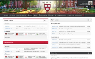 The New my.harvard
 -
A Newly Responsive CrimsonWe are honored to have created one of the first responsive college newspaper sites in the Ivy League and among the first worldwide.
-
 Science Center Plaza Alternatives
 -
Note to Our ReadersAs you may have noticed, there is no separate sports section this Monday, as there has been for years. Many of the stories that would have been in that section appear here in the flagship daily paper, but some do not.


