{shortcode-c1e0463a54412ca871456e5391ef87e1866cc011}
According to researchers at MIT, the Leverett House dining hall is the most economically segregated place at Harvard.
In the Atlas of Inequality, a tool created by the MIT Media Lab, the d-hall has an inequality index of 97.2 percent, and it is visited almost exclusively by low-income people.
Esteban Moro, the principal investigator of the project, created the Atlas in 2016 in order to quantify “micro-segregation” in U.S. cities. He says the government tends to focus on broad residential patterns of inequality, classifying people according to neighborhood-level statistics when conducting censuses and drafting legislation.
“But a lot of the inequality that we experience in our lives is embedded into the things that we do, not where we live,” Moro says. In particular, the places people visit — the cafes, bus stops, movie theaters, and stores they frequent every day — are the primary driver behind the income segregation they experience. Moro and his team are attempting to map this “place inequality,” a measure of how often people of different income levels cross paths, at a finer resolution through the Atlas.
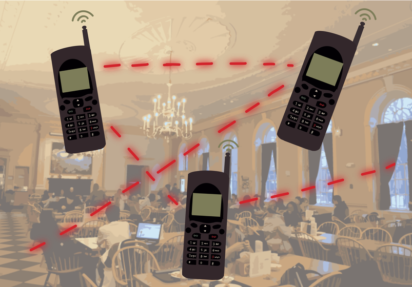
The researchers compiled six months of anonymous location data from 150,000 mobile devices in the Boston area. They assigned each user a “home” census block based on where that person spent the most time in the evening hours and estimated their income level based on the median income of that census block: low (below $67,000), medium, upper medium, or high (over $114,000). Then, the researchers counted each instance a user stopped for more than five minutes in a particular place as a “visit.” For the 30,000 most-visited places in the area, they determined the share of visitors from each income level and assigned the place an “inequality index.” The most unequal places, with higher inequality indices, were visited primarily by people from a single income level; the most equal were those where people from all four income groups spent roughly the same amount of time.
The resulting Atlas looks like a bird’s eye view of Boston at nighttime, a smattering of color-coded dots overlaid on a gray map of the city. It shows that Harvard Square is one of the most economically diverse places in the Boston area, according to Moro.
Nonetheless, zooming in on the Atlas around Harvard’s campus reveals that even among people who attend the same university, there are disparities in where they choose to eat, shop, and study on a daily basis.
Though none of the other Houses are as unequal as Leverett, Currier (86.6 percent), Quincy (79.7 percent), and Eliot (69.2 percent) have relatively high inequality indices as well, all dominated by the low-income category.
Memorial Church skews wealthier, with a 72.8 percent index and predominantly high-income visitors. So do athletics facilities: most Blodgett Pool visitors are from the upper medium-income level, and most Murr Center visitors are high-income.
Some of the most equal places in the area are businesses in the Square, including Felipe’s (11.1 percent), Newbury Comics (10.4 percent), and the recently-closed Starbucks (10.3 percent),but CVS and Darwin’s Ltd. are predominantly high-income.
Places that are similar in function can have drastically different visitor profiles — Widener Library is mostly high-income, while Lamont is mostly low-income. So too can places located in very close proximity — the Law School library is mostly low-income, while the Harvard Law Review is mostly upper-medium. The Business School dining hall is mostly low-income, while the tennis courts just down the street are mostly high.
Moro cautions against putting too much stock in the index of any single place, especially on a university campus where most residents are temporary and their true “home” locations are harder to determine. The greatest value of the Atlas, he says, is in its potential to raise awareness of how our daily routines can contribute to large-scale patterns of segregation. That is, the Leverett dining hall is not necessarily uniquely flawed, nor even truly the most segregated place on campus — but its provocative red spot on the map does challenge the assumption that the University is a great equalizer for all its students.
“Two people who are living next door can have a very different experience of segregation in their lives,” Moro says.
The Atlas can also provide immediate feedback on how a change — a new park, a cultural event, or even a pandemic — affects the economic composition of a given place, instead of waiting several years for differences to show up on the census. In the past two years, Moro has seen income segregation increase significantly as people isolate themselves in smaller social bubbles and spend less time venturing to new places. He hopes that the gradual adjustment to post-Covid life will include a re-examination of our habitual behaviors and an investment in new types of physical and social infrastructure.
“I’m optimistic — the data tell me otherwise, but I’m optimistic — that we can mutually build a more diverse society in the future,” Moro says. “We don’t want to come back to what we had before.”
— Associate Magazine Editor Sophia S. Liang can be reached at sophia.liang@thecrimson.com. Follow her on Twitter @totalPHIAsco.


