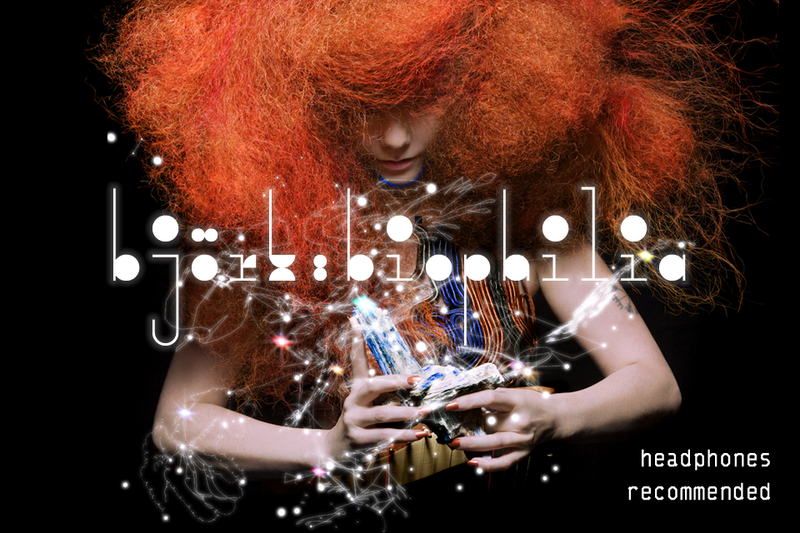
Björk fans need not worry—the Icelandic singer hasn’t stopped being really, really weird.
The release of her newest album, “Biophilia,” is accompanied by an app for iOS devices that bills itself as an “extraordinary and innovative multimedia exploration of music, nature, and technology.” If you ever wanted to listen to her music while watching a dramatic video of DNA replication or you wanted to use lightning to create the same arpeggios she uses in her music, you won’t be disappointed.
But though the “Biophilia” app sets out to bring a different dimension to her newest release with a litany of visual and technological effects, the connection between the app and the album is tenuous at best.
The app is organizationally centered on a sprawling three-dimensional structure of meandering lines, odd shapes, and multicolored stars, each of which represents one of the tracks from the album. The structure can be navigated by zooming in with a two-finger pinch or rotating it with one finger. As you zoom in closer to a star, its corresponding track begins to play.
Tapping one of the stars takes you to its submenu, which presents a short blurb about the song. Each application also comes with two longer passages: a general explication of the relationship between the app and the song, and the other a “musical analysis” of the song’s form, texture, and composition. These passages are some of the most redeeming aspects of the application. They provide an accessible and often fascinating window into the creative process behind an artist known for her cerebral esotericism.
In addition to the writing, each menu presents four options: play, score, animation, and credits. “Animation” takes you to a screen that scrolls by with colored bars and circles that light up in time to the song and in positions that indicate the relative pitch of the instruments. “Score” takes you to a screen that shows the individual notes and rhythms of the songs on a collection of staves, albeit in a stripped-down version that substitutes the actual instruments and vocals for more easily transcribed MIDI tracks.
But the heart of the “Biophilia” application lies in the “Play” feature, which takes the user to some sort of interactive activity—sometimes a game, sometimes a clip, sometimes just something to mess around with.
Most of them are entertaining for a little bit, but they don’t really go anywhere. The “Sacrifice” app is a bunch of shapes that play a very short sample of a sound from the song when pressed. You can organize them into sequences and play them back, but you can’t play any two sounds simultaneously, so the end result is less a creative rearrangement of the original and more an incoherent mess of sounds. The “Virus” app consists of a bunch of cells that slowly become invaded by viruses that you’re supposed to fight off. The whole thing happens very slowly, though, so it isn’t very engaging.
A few of the apps are genuinely fun and interesting. The “Crystalline” app is basically what “Katamari Damacy” would look like if Björk had designed it—you roll a crystal through tunnels collecting other crystals of various colors as the song plays. And the app for “Dark Matter” will entrance music theory enthusiasts with its thirteen glowing stars, each of which represents a note in the chromatic scale. When you touch one of the stars, a series of colored lines emerges from it and connects to other stars. Each different color represents a different kind of scale, from standard major and pentatonic scales to exotic scales like “ultra-Locrian” and “Egyptian.”
Ultimately, though, the interactive features never feel like they connect to the songs on any level other than the superficial. Yes, the song is called “Crystalline” and its app has something to do with crystals, but it’s here that the interaction between the music and software ends.
The “Biophilia” app will more than satisfy diehard Björk fans (Ed. Note: all 13)—between the written materials and the “score” and “animation” features, it opens up a window into the music that most artists never give their fans, at least not to this extent. And it’s all in a package that very much fits with Björk’s bizarre aesthetic.
But if you weren’t a Björk fan before, you probably won’t know what to make of the “Biophilia” app. For all that it intends to add to the listening experience, it ends up being a collection of reasonably cool to genuinely fascinating things that ultimately have very little to do with the album itself.
It’s true that trying to integrate music, technology, and visual effects into a coherent experience is a tall order. But for the relatively steep $10 price it costs to unlock all of the songs and for the 725 megabytes it will eat up on your device’s memory, the result is a bit of a letdown.
Read more in Arts
Five Interesting Authors To Follow On TwitterRecommended Articles
-
Top Five Songs That, When You Think About It, Aren't That RomanticBen analyzes some lyrics and starts to get worried.
-
Students' Song Benefits Haiti ReliefIn commemoration of the one-year anniversary of the devastating earthquake in Haiti, a group of Harvard students recently released a song and music video to raise funds for those affected by the disaster and spur continued awareness.
-
‘Biophilia’ Conceptually Brave, Musically LimitedThat the album avoids bloated overindulgence is miraculous. Surprisingly, though, its only weak spot is an element of restrictive simplicity. Björk’s lyrics and sonic architecture almost align in a titanic vision for “Biophilia,” but the album’s stylistically constrained instrumental strategy stunts that conceptual richness.
-
 Mumford & Sons Build a Tower of Cliche and Insincerity
 -
 Rising Parisian Singer Floats Over Weightless Debut
 -
 Metronomy Writes Haunting, Nervous "Love Letters"


